An Accessible Color Scheme for Bootstrap Buttons
A while ago while doing an accessibility review of a site I was working on, I realized that the button styles I was using, which I imported from Bootstrap 3, were failing my accessibility checker. The default colors of the primary, default, and warning buttons all fall short of the 4.5:1 contrast ratio required for WCAG 2.0 specs.
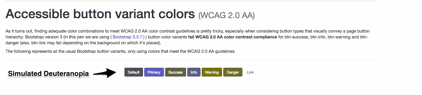
At first, I assumed I just didn’t have the latest version of bootstrap, but after searching around I found a post on bootstrap’s Github page, which essentially said they aren’t interested in changing their design to accommodate at this time. Disheartening to see from a big company/framework, but not to be deterred, I headed over to Google. I assumed I could find some neat little CSS classes someone had created, and continue my day. I found a post from Scott Galloway on Codepen that I thought was perfect, but when I ran it by my coworker for review, he pointed out that if someone was color-blind (as he was), it was really difficult to determine which button was which:
Out of easier options, I took a shot at it myself. Working with some of my coworkers, I came up with some requirements we had for the buttons:
- Pass WCAG 2.0 Guidelines
- Work well for common color-blind variants
- Maintained the look and feel of the Bootstrap
A common recommendation was making a custom color palette and changing them completely. Our issue with that solution was that the buttons were part of a custom CMS, and if you’ve never worked on a CMS, users tend to get unhappy when you drastically change their designs without warning. Because of this, the last point of maintaining the look and feel was important. In a perfect world, we could change the buttons without anyone noticing.
Here is a demo of what we came up with
(The trick was to invert the hover/active color to have a white background and colored text, otherwise making the info and warning buttons dark enough to pass accessibility made them either hard to differentiate, or just plain ugly.)
It worked! We swapped the styles out in our custom CMS and have never received a complaint from our users about the change, and can feel good that the buttons now pass accessibility. I figured there may be some other developer out there right now looking for the same thing and threw it on Github. Hopefully, it can save someone a little bit of time and make their site more accessible.
(On a side note, yes, my site has some accessibility issues, it’s on the to-do list, my only excuse is I made the theme about 5 years ago, and am just getting back into writing here.)